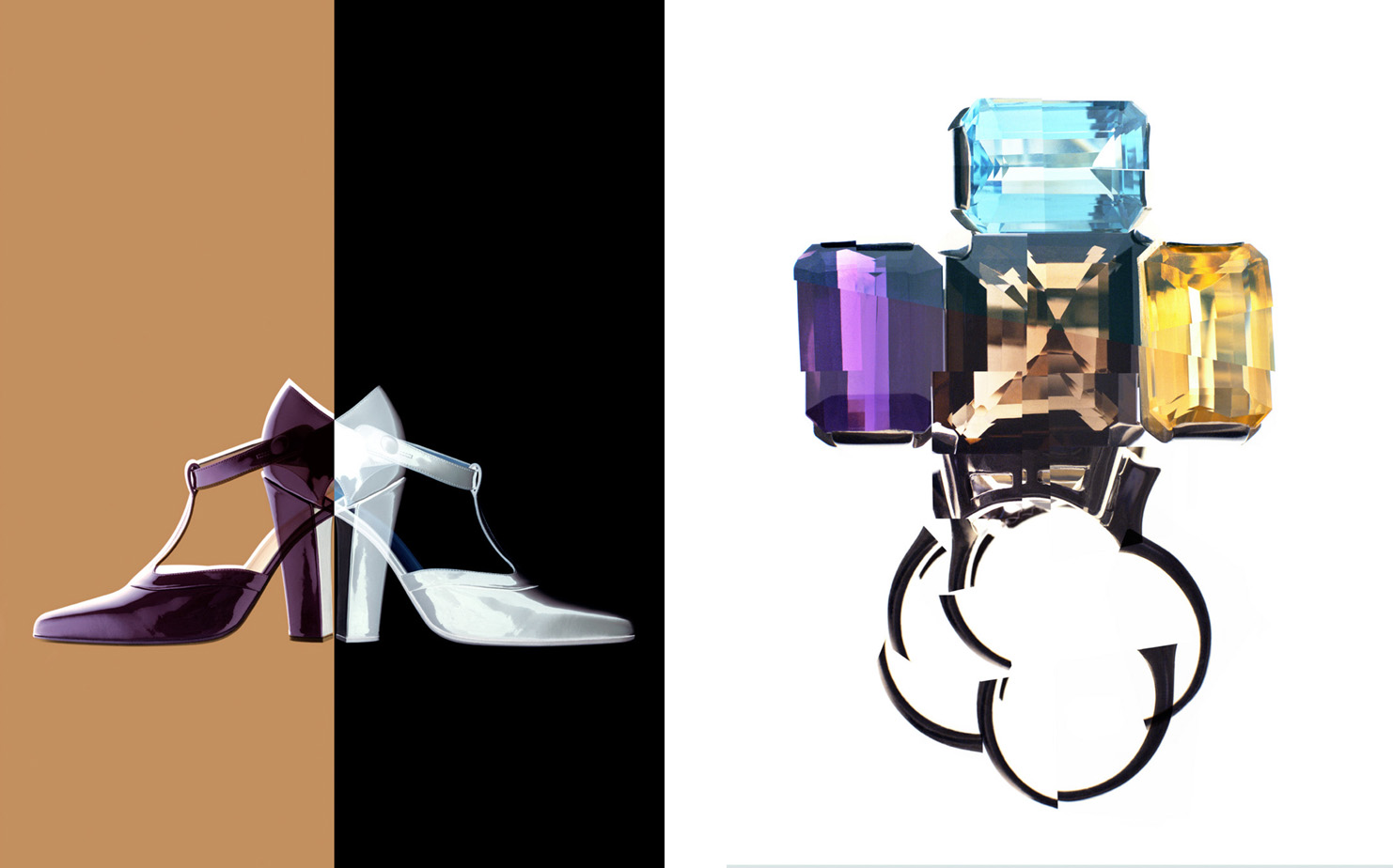
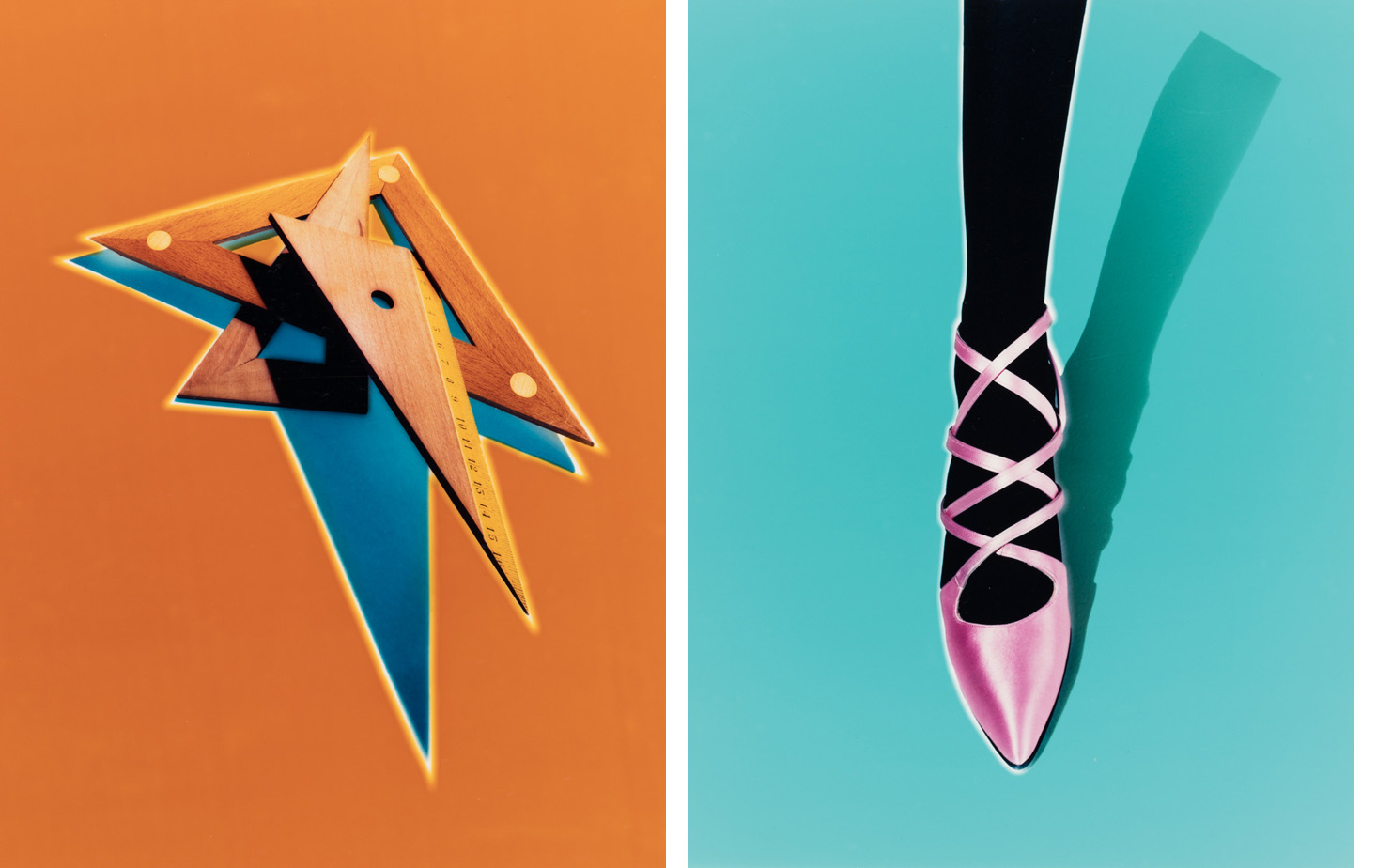
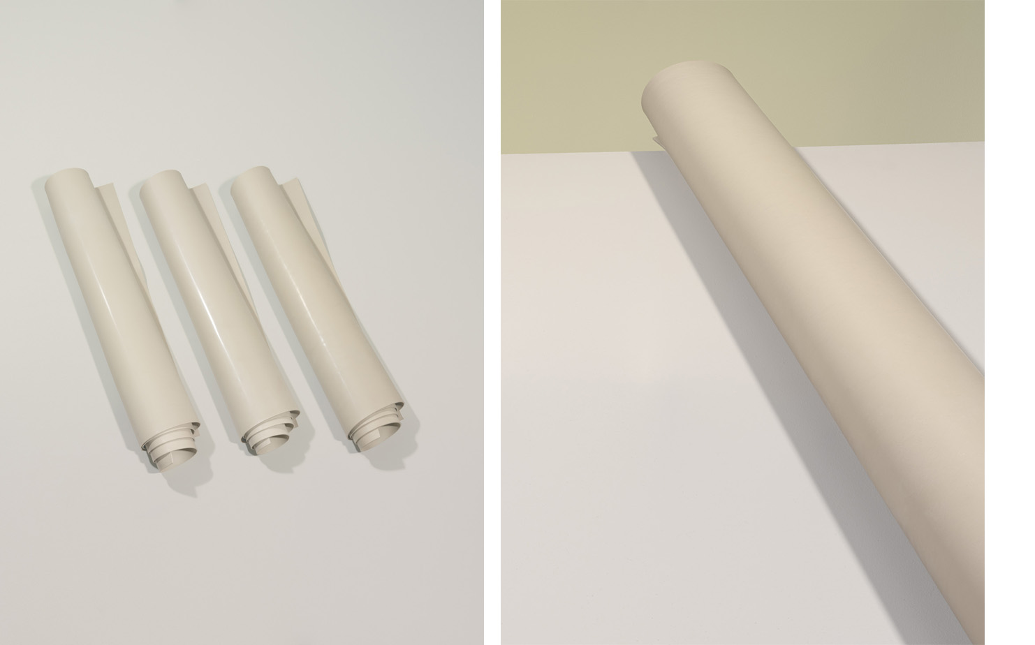
Raymond Meier is a photographer whose creative practice is underpinned by a deep understanding of the medium’s techniques and processes. He has been a photographic innovator who has developed the chromatic aesthetics of the medium, led the way in the application of new and revised technological photographic processes, and has established high benchmarks for mass-media image-making. Born in Switzerland in 1957, his fascination with the technical and creative possibilities of photography began in childhood, and he constructed his first darkroom aged twelve. Meier undertook an apprenticeship at the Zurich Art School in 1972 and, at the age of twenty, he opened his first studio in Zurich. In 1986, after ten years of honing his experimental processes and elegantly precise photographic style, he moved his studio to New York City. Over the past four decades, Raymond Meier has been a consistent influencer upon the visual direction of publications including American Vogue, Harper’s Bazaar, and The New York Times Style Magazine, at points of radical change within their respective publishing stories. During the mid-to-late 1980s, Meier was at the forefront of the movement of editorial and advertising photography towards complex darkroom-based color image-making. Up until the late 1980s, black and white photography was still the reprographic industry’s mainstay, with color images captured on color slide film [“Chromes”]. The arrival of a new work flow for color photography, forwarded by image-maker Nick Knight in the UK and then Meier in the US, called for elaborate experimentation in the analog darkroom and the creation of C-type color prints as part of the reprographic process for printed magazines and advertising. Meier was also a crucial figure in the early adoption of digital post-production software in the early 1990s and set precedents for the arrival of an almost entirely digital landscape for fashion and beauty image-making in the 21st-century. He has spent the first fifteen years of his over-forty-year creative career absorbed in stretching of the capacities of analog color photography, and the subsequent over-twenty-five years in constant experimentation with the properties of digital photography. The photographic portfolios that book-end this interview mark the span of Meier’s color photography: A portfolio of editorial and advertising images from 1990-1997, begins with analog darkroom techniques, and moves into a selection of his earliest hybridization of analog color film capture with digital manipulation that pushed commercial color reprographics into its first creatively-led digital iterations. The second portfolio concentrates on Meier’s independent photographic projects made since 2009, using digital photographic capture and rendered as pigment prints, with reductive and subtle color palettes that speak to the legacy and creative relevance of “analog thinking” in the digital photographic field.
Raymond Meier: I think we should start by saying that it is such an amazing thing to be talking on the topic of color photography.
Charlotte Cotton: I suspect this is your fantasy photography conversation…
RM: Every photographer dreams about reaching a version of color photography that has true fidelity to their vision. We have our vision of what color can be and then have to deal with how to technically and practically reach this. You don’t fully find your color palette until you see it emerge in the process. Ahead of that, you are anticipating it, dreaming it.
CC: You were instrumental in shifting the workflow of image reprographics for magazine printing in the mid-to-late 1980s. This was a really important moment in the story of color photography, when innovative photographers opened the door for more ambitious, subjective and experimental visions in color. Specifically, you were one of the first photographers to push for a movement away from “chrome” color transparencies [slide film] as the industry-standard for color imagery and the dominance of black and white photography on the pages of printed magazines. You were part of the very small group of photographic innovators who moved photography’s creative industries towards making color prints - C-prints - which allowed for much greater control of and spectrum for the color of photographic images.
RM: I remember seeing Nick Knight’s images for the Japanese fashion designer Yohji Yamamoto in about 1986, and I could not believe that this was somehow possible. These were photographs that I had not seen before. We have to give Nick Knight the credit that he initiated this important shift from color slide film to photographic prints because nobody else was coming even close to breaking the boundaries of color photography at this time. For me in New York, I could not achieve the results I wanted by staying within the conventional boundaries of color photography - working with color slide film - because of the unsurmountable restrictions of the process. Adopting a process of creating C-type photographic prints promised a way to get the colors that I was truly aiming for because the work was done in the darkroom, and it was the process where I was controlling every step of the darkroom journey and defining the color palette.
CC: How did you convince the magazines and the repro houses back in the mid. 1980s to accept the print as the form of your delivery of the image?
RM: I remember when I started to use color negatives and started to make C-prints, I had a tiny wet darkroom at the time, with everything done by hand. I made my first C-print, I loved it, I packed it up and sent it to the magazine and within ten minutes of the editor receiving it, I get a phone call, “Oh Raymond, thank you so much for this beautiful print. We just love it. When do we get the chrome?” and I had to say, “I’m sorry, you are not getting a chrome anymore”. The chrome was the standard of the industry. And you also have to keep in mind that the repro-houses were set up with large drum scanners, that could fit maybe 50 chromes on one drum. And now this photographer comes with this lovely 16”x20” print and the scanner couldn’t accommodate any other images on the same drum cycle. The C-print made the repro-houses’ work so much more complicated and they weren’t immediately equipped to do this. Their workflow with photographic prints centered on black and white prints. The would use a film “repro” camera to photograph the print and create a monochrome transparency ready for scanning. This process just wasn’t calibrated or refined enough to work for color C-type prints. You have to imagine that if someone breaks the workflow in this huge industry, there is going to be a real pushback. But within six months to a year of my persisting with delivering color prints, many fashion and beauty photographers in the US had started to adopt the C-print process and demand a shift. The reprographics industry had to change their workflow and accommodate this new reality.
CC: What did you make with this radical new color workflow?
RM: I was the kind of photographer who used color as a way to be experimental – to do things in the darkroom with masking and silhouetting, and multiple exposures. Nobody really knew how anyone else made their version of experimental color at that time - I don’t think we were secretive but things moved at such a fast pace that there was no time for a dialog. Something was cool one day and then you had moved on by the next. Quite a number of photographers’ way into color experimentation in the late 1980s was through developing transparency (slide) film in negative developer – in opposition to darkroom standard conventions - and you had a rebirth of what was called “cross processing,” which could create extraordinary colors ranging from delicate pastels to almost psychedelic, bright hues. The reward was that you could create new color palettes. This is probably one of the most fascinating things about photography – to create something that you nor anyone else had ever seen. It was fun to do all of these forbidden things and not to follow the rules, and it was a time that photographers’ breakthroughs were immediately picked up by magazines, and permeated through visual culture.
CC: Earlier, you used the word “fidelity” to describe the quality of color that photographers aspire to. In the context of the creative industry that you have navigated and undeniably shaped, I wonder what color fidelity means to you. I think that your idea of “fidelity” of color is routed in a journey of personal experimentation but I imagine it is also grounded in the context of popular taste and the directions taken by magazine’s editorial teams.
RM: What is the motor in photographic production? Everybody – photographers, art directors, editors - wants to push photography to the next level because we are unhappy with the current state of play. Otherwise, why would we push? For someone who makes images, so many things can go wrong by definition. It could be as stupid as forgetting to put film in your camera, or the lab loses your film, or something goes wrong with the processing, or the camera malfunctions. The list of what can go wrong with photography is endless. People always look for different things and perhaps you could say that through photography’s history, makers have wrestled with color photography because black and white wasn’t enough. Thirty years ago, we wanted newspapers to show us color images and even if those colors were wrong and ugly, it was more important for us to see in color than for the images to be beautiful. By the late 1980s, editorial and advertising photography had reached a stage where people wanted to be surprised, photographers wanted to surprise audiences and clients, and visual culture was ready for this. It didn’t have to be good, it just had to be different. When you see something for the first time – as with all things – it has an incredible power.
CC: Where does this desire to push beyond the conventions of color first happen in earnest for you?
RM: I think it was always there for me. You have to remember that when I started in the 1970s, we photographed things on chromes – they came back from the lab, they had a color cast, you had to re-shoot, you had to put a filter into the camera, the color was shifting, the color wasn’t right, you were frustrated that maybe the greens were dull and dirty so you were wishing there were better greens. Over forty years later and in our digital creative space, the greens look fantastic. But you know what? Today, I prefer my ugly greens from the 1970s. If I think about the past forty years, I think of all of the processes and technical advances from chromes, to color negatives, to the colors of Fujiflex, to the colors of Agfa…the list goes on. Each time I tried a new material, at first I loved it and by the end I hated it and the next material came out and I thought that all my problems would be solved and they never were. In the middle of those forty years there was the digital transformation – I truly hoped that scanning and digital manipulation would resolve everything because I could, say, make my greens lighter and the skin darker with the kind of ease that I have never experienced with analog photography. At the beginning of digital processes, we thought all the problems with color photography were solved forever. Now, we realize that nothing got solved – we are permanently trading one thing for another thing and we are actually not really advancing. If you look at color sixty years ago – at Kodachrome film – the colors were so “wrong”, you can’t make it more wrong. But they are so beautiful. People start to miss it, suddenly we realize the beauty we have lost.
CC: I want to save up talking about the 21st century and what got lost in the rise of digital capture. But you were one of the very early adopters of digital post-production – of Photoshop and its precursors – Paintbox - in the early 1990s.
RM: I think I can take the credit for introducing the digital work flow into the creative industry in the US from late 1991. I was still shooting on film but no longer making a C-print for reproduction. Instead, I was scanning the film and manipulating the colors with software. The moment I realized the power of digital manipulation, I shut down my color darkroom. I think about digital photography as carrying the same experimental capacity as analog processes but just with profoundly more possibilities. The moment that you introduced a computer into the work flow, there were no more boundaries - you just had to make your wish and it would happen. It wasn’t for a few years that I think we realized that, yet again, we had traded something valuable against these new image technologies. At the time, it didn’t matter. I think I was aware of what I was about to lose but I cared most about what I was about to gain because that was the exciting part. Now, almost thirty years later, I’m saddened by all the things I lost in analog color photography.
CC: I see the arc of color photography’s narrative a little differently in the sense that I think what you and the other experimenters such as Nick Knight achieved in the 1980s was to take analog color photography to its limits. One of the characteristics of these complex processing and darkroom practices was their “proto-digital”quality. In particular, I think of this in relation to your use of masks that meant that you could expose one area of an image and construct its coloration without any material shifts on any other part of the image. That is, for me, the creative bridge that was made between analog experimentation and the infinite possibilities of digital photographic manipulation and control. That said, there was still something within the analog processes that you were using until 1991 that was the antithesis of digital image-making as we know it now – namely, that analog color photography can be built up in a complex way but is inherently consequential. The cumulative order of the steps in an analog process have meaning and affect, and you start again each time that you set out on the journey of making a print. Perhaps digital image-making sacrifices the soulfulness of analog color processes for an algorithmically-generated spectrum.
RM: With analog photography, you are working with materials with inherent beauty. The imprecision - even the mistakes - in the analog color processes have an organic beauty and we used them in unexpected ways in the 1980s. Even when you set out with a very clear intention, the factor of the unknown is built into analog color photography. As a print rolls out of the machine, there is always an element of surprise, and you are never able to repeat the same print again. These tolerances or “mistakes” add to the quality and beauty of color photography. Absolute perfection is deathly and in digital photography we have millions of ways to reach a perfect chromatic plateau, but the chance that you will not find the optimum way is almost guaranteed. I don’t perceive digital photography as the problem but I think we underestimate its complexity.
CC: Would you hazard a guess about whether it is easier or more difficult to use digital imaging to create color in comparison to analog color photography?
RM: I would say that they are very similar, I think they both take a lifetime to master. If I hear young photographers talking about how much they love analog photography, I wonder whether they gave up too early in trying to work with digital processes. In a way, of course, I understand the contemporary fascination with analog color photography, which has been reborn in a reduced and niche way in the 2010s. The chance is that something beautiful will be rendered with analog materials is substantial. Technically-speaking, the post-production and image capture of digital photography make photography ostensibly “better” than ever but I think we lost the possibilities of the shortcomings we had to work with in analog color photography.
CC: What is the difference between the way in which digital and analog processes capture color?
RM: Digital capture is precise, analog has imprecision. Analog film outlines the captured subject - it responds to the sculptural forms in front of the lens in a material way because each color and its density is held in the minutely differentiated layers of an analog film. It creates a 3-dimensionality and amplifies color by being merged with texture and depth in a way that is unique to analog capture on film. A brown jacket is as much about the folds and the texture as its color – and the color is inaccurate on film! Digital capture scans every detail of the scene and flattens everything into pixels, and it shows the brown jacket in its true color and detail. It’s correct but unspectacular and without that specificity of analog imprecision. I actually prefer now to work with digital capture and start with the “correct” color and be in control of every decision that can make this brown jacket rich and tangible, and beautiful in my way of perceiving it. I have an understanding that many people hate the seemingly boring and flat photographic capture of digital photography but I prefer to work with this over the expectation that color film will do the work or the digital screen will inevitably make the color of an image “pop”.
CC: Given that digital photography can present practically any color, do you think that a new version of color - a new “fidelity” to quote you – is at play?
RM: I don’t think we have creatively reached that point yet, we are still in a phase of referencing photography’s analog past. I don’t even know what to think about this. In the digital age, we can only reference analog color palettes and as history moves forward, these are the only palettes we have. From carbon prints to color negatives and C-prints…it’s such a short period of time. Are these really the only references for the rest of time? For me this is actually a deep crisis in photography, you can digitally simulate this relatively short history of color photography, but how sad that we are so preoccupied with re-referencing.
CC: How do you deal with that in your own practice?
RM: I think my two Cubes works, where I studied the color palettes of Morandi’s still life paintings, were very much prompted by my frustration with color photography. I just wasn’t going to accept that I like the colors in paintings better than those in photography. I found a few answers but not all the answers I seek by far. I see no reason why I shouldn’t get the same aesthetic pleasure out of a color photograph as a painting, I see no reason why we can’t push color photography in its digital form in experimental ways. I don’t think we progressed so much in the course of color photography, and we adapt to the new industrial standards. I think we lost a lot and perhaps have started to know what we are missing, and I just hope that many of us will not settle for this. Color photography is too important and too interesting.